

Shodo Daisuki Episode 46
Shodo Daisuki Episode 46
Take Freedom in Your Hands! A Guide to Creative Calligraphy!!【Calligraphy】
Shodo Daisuki – Episode 046
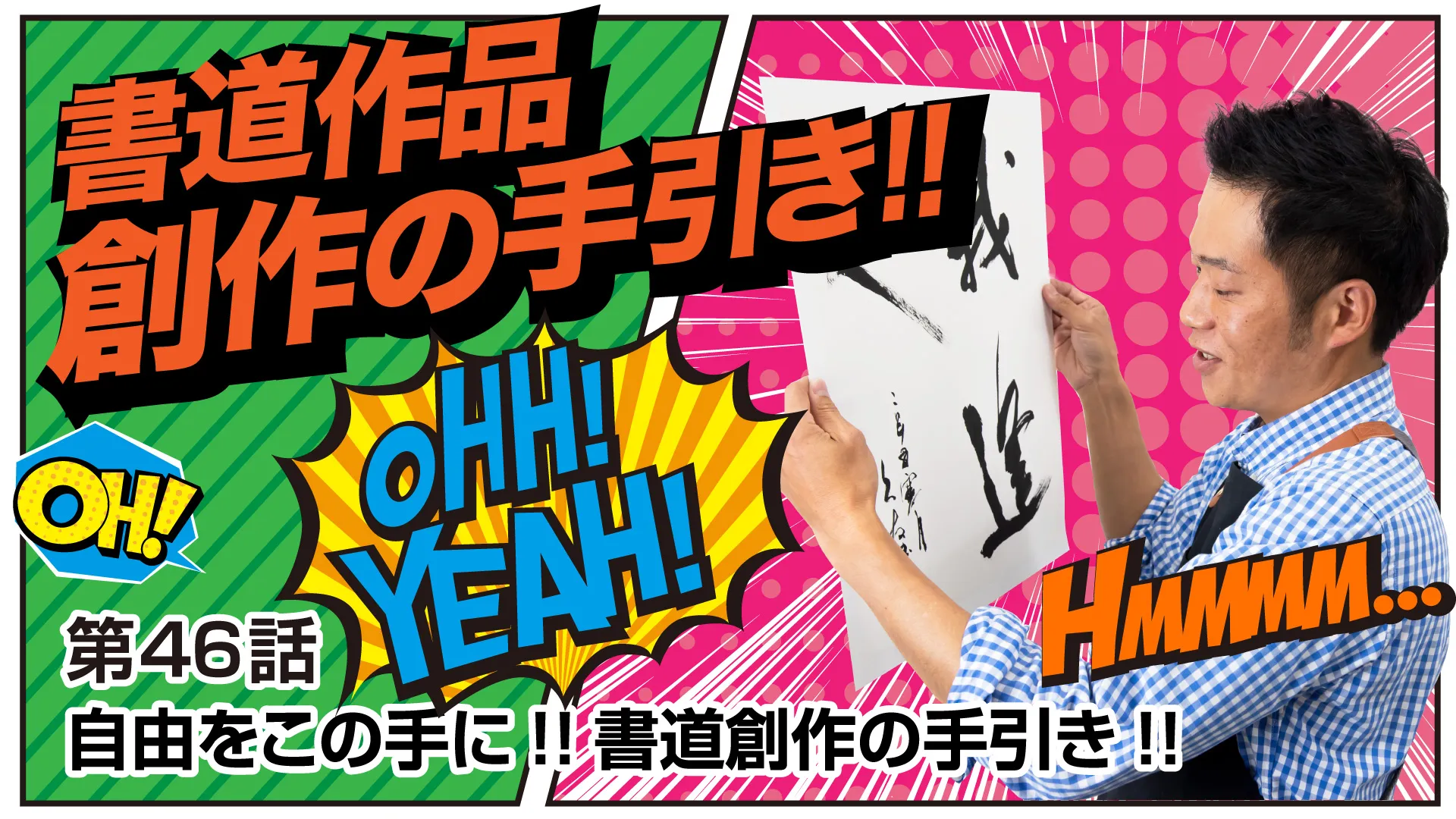
While explaining the step-by-step process of creating an original piece, “Shimauchi” takes on his very first creative work!!
Take freedom into your own hands and write characters that belong only to you!!
A man who truly loves calligraphy, “Shimauchi,” gives a thorough explanation!!
Shodo Daisuki Episode 46 — Video Overview
This video is a lecture by Shimauchi on the process of creating a calligraphy work.
He explains that although creating a calligraphy piece may look simple at first glance, in reality there are many different elements that must be considered.
Since Shimauchi himself has little experience with original creation, he proceeds in a style where he takes on the challenge of creating together with the viewers.
In the lecture, he explains in detail the sequence of steps for creating a work: starting with deciding the size of the paper, then choosing the phrase you want to write, considering the number of characters, deciding on the script style, making composition drafts, and finally selecting the tools to use.
He also introduces theoretical aspects of composition, such as the formal characteristics of each character, the beauty of the blank spaces on the paper, and how to create focal points within a piece.
Shimauchi chooses the three characters for the phrase “Ware hito to au nari” (“Ga Hito ni Au Nari,” often written as 我逢人) and creates a piece in a one-third hanshi-scroll size, using the semi-cursive style of Mi Fu (米芾) of the Northern Song dynasty as his reference.
He explains that he chose this phrase out of gratitude for all the encounters he has had so far and from his desire to cherish the encounters yet to come.
At the end of the lecture, he talks about the joy that comes from attempting creative work, and the value of how it will change the way you view other people’s works.
He encourages those learning calligraphy to try creating pieces of their own.
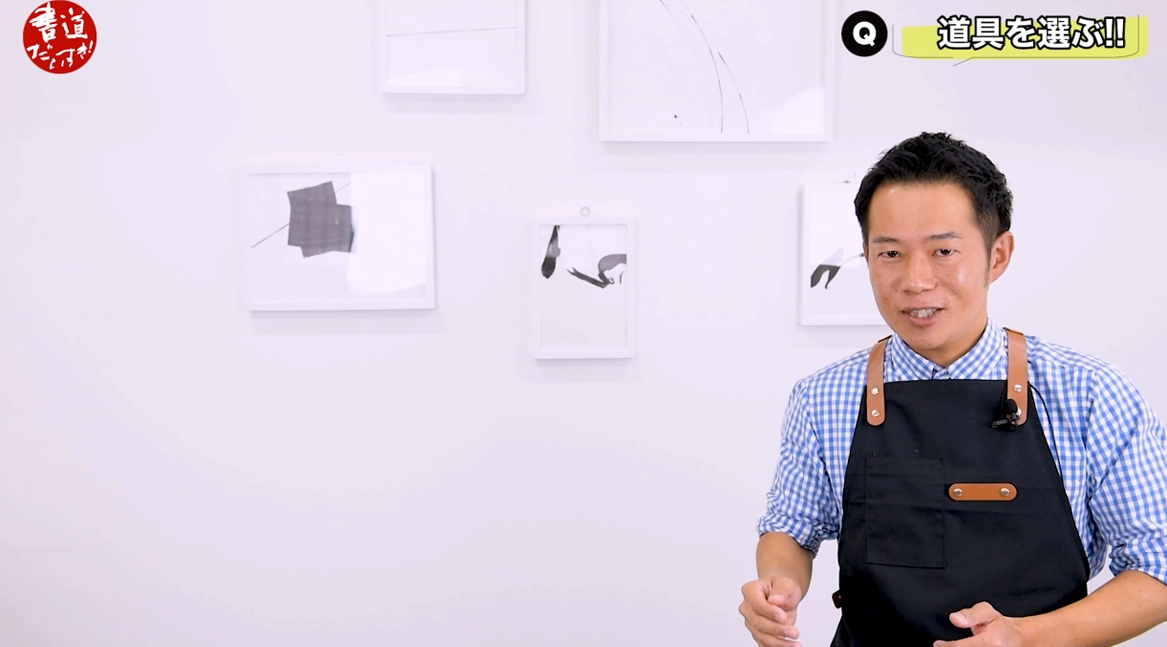
YouTube Shodo Daisuki Episode 43
Shimauchi 00:00
Hello, it’s Shimauchi, the guy who loves calligraphy.
This time I’ll be talking about creating calligraphy works — in other words, creative pieces.
When you hear “creating a calligraphy work,” you might picture a dignified, authoritative master who just says “All right, here we go,” and then dashes off a piece in one go.
Shimauchi 00:19
But in reality, it doesn’t seem to be that simple.
So, what exactly are they paying attention to, what are they careful about, and what are they focusing on?
If you watch this video all the way to the end, I think not only the way you create works, but also the way you look at them will change 180 degrees.
So please stay with me until the end.
On this channel, I introduce all sorts of topics related to writing, not just calligraphy,
so I’d be very happy if you’d subscribe to the channel and give it a high rating and such.
All right then, let’s begin!
Shimauchi 00:56
Up to now we’ve been building up our practice of copying classical models.
We’ve studied “shape-copying” (keirin), “idea-copying” (irin), and “back-copying” (hairin) as well.
Next, you might start to think, “I want to create a work of my own.”
But maybe you don’t really know how to go about making a piece and don’t know where to start.
To be honest, I, Shimauchi, hardly have any experience with creative work either.
Shimauchi 01:15
So, this time I’d like to introduce the steps of creative work while I myself also take on the challenge of making a piece.
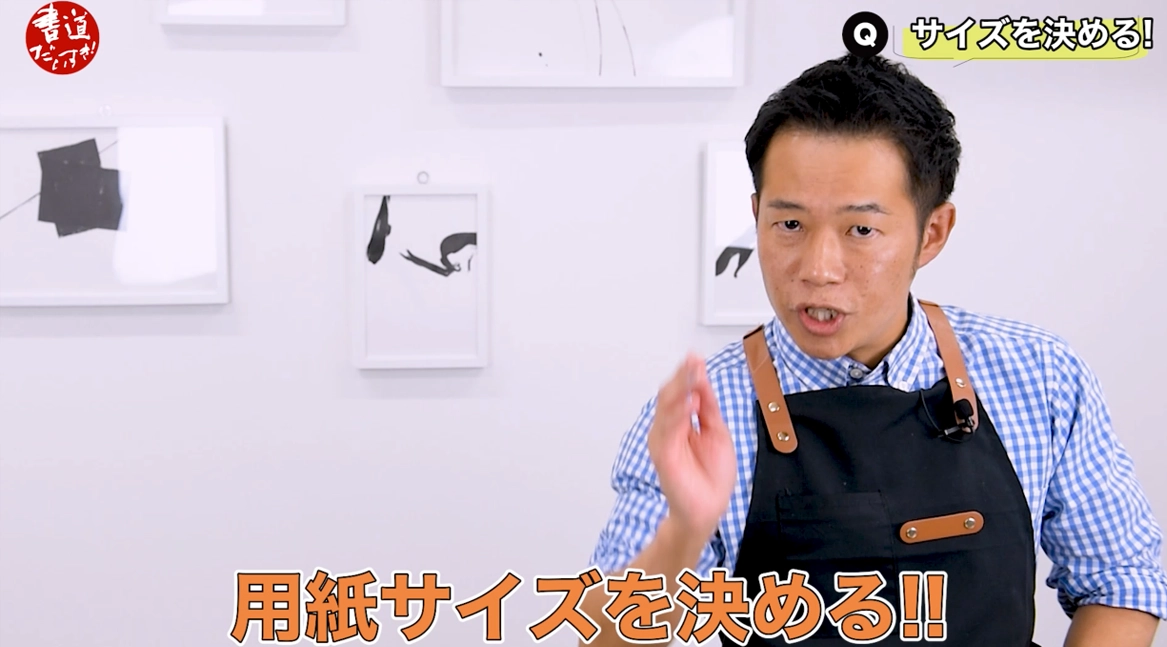
First, decide on the paper size.
The size of the work will depend on what you want to do with the finished piece.
If it’s a work you’re going to submit to an exhibition,
it will probably be on full-size paper or on hansetsu (half-cut scroll) size,
and if you want to take on a public competition,
you’ll have to follow that competition’s specific size requirements.
In that case, the paper may be even larger.
Shimauchi 01:53
If you want to send the piece to someone or hang it on a wall in a room,
you will naturally be looking at smaller works.
That might be hanshi size or shikishi (square card) size.
Even if you go a bit larger, it would probably be something like one-third or half of a hansetsu scroll.
This time, I want to hang the piece on the wall here behind me,
so I’ve decided to challenge a one-third hansetsu size.
Shimauchi 02:13
Next, choose the words.
At the root of it all is usually “I really want to write these words,”
or “Because I have this feeling deep down, I want to create a piece.”
You might choose auspicious words so you can give the piece as a gift to someone special.
Or you might want to decorate your room with something that conveys the season, and choose words that match that feeling.
All of these are possible motivations.
Shimauchi 02:52
However, there’s one thing I’d like you to be careful about here.
If all of the characters in the phrase you choose are kanji,
you have to pay attention to the fact that each character has its own distinctive structure and form.
Each character has its own characteristics:
some are vertically long, some are horizontally long (flat),
some are more square, and some are more triangular.
Shimauchi 03:35
So when you combine the kanji you’ve chosen,
you need to consider whether the overall balance between the characters will work out well or not.
Taking that into account,
the ideal situation is to choose a phrase you truly want to write while keeping an eye on these structural elements.
Shimauchi 03:55
Now let’s talk about the number of characters, which is related to that.
For example, when creating a piece on hansetsu size,
I think many people choose to write around 14 characters.
If you tried to write 10 characters on this hansetsu size, or tried to fit 14 characters on a hanshi sheet,
well...
Shimauchi 03:54
it would probably end up feeling pretty cramped, wouldn’t it?
On hanshi size, an appropriate number of characters would be, I’d say, from about 1 to 6 characters.
So, choosing the number of characters that suits each paper size
Shimauchi 04:10
is also an important factor.
So, I decided to write the phrase “Ware hito to au nari,”
commonly written as the three characters 我逢人 (“I meet people”).
I, Shimauchi, have truly been blessed with wonderful encounters up to now.
And I believe I’ll continue to meet many people in the future as well.
Shimauchi 04:31
I want to cherish those encounters, so I decided to write these characters, 我逢人.
Next, it’s finally time to decide on the script style.
Once you know what phrase you want to write, you then have to think about what style you should write it in.
For that, you have a very strong ally:
the calligraphy dictionary.
Shimauchi 04:53
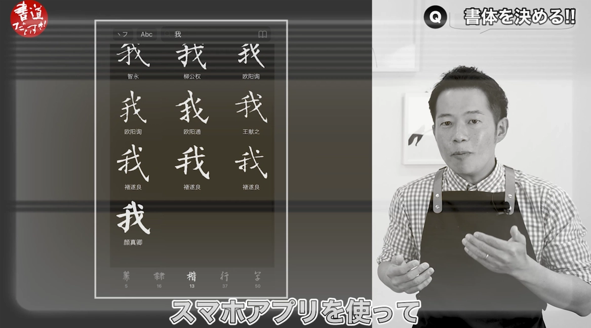
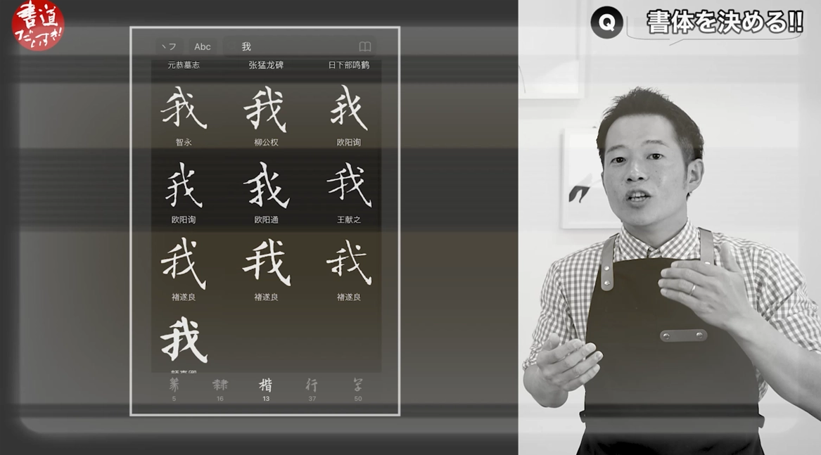
These dictionaries allow you to look up a wide variety of classical scripts in many different styles all in one place.
It’s incredibly convenient.
And I’ve heard that nowadays many people use smartphone apps as their calligraphy dictionaries.
Shimauchi 05:13
That’s even more convenient, right?
I kind of want to try them myself.
If, within all those examples, you find a style that makes you think, “Yes, I want to write in this script,”
then you’re very lucky.
But even then, the important thing is not to just copy that example exactly as it is.
Shimauchi 05:32
Please use those examples as material to arrange and adapt.
The examples are only small excerpts taken from larger classical works.
In the original classics, of course, there are characters written before and after each one.
It’s in the interaction between those surrounding characters that the form of each character is decided.
Shimauchi 05:50
But the dictionary just cuts out that one character by itself.
Strictly speaking,
you would ideally place the actual classical work you’re imaging beside you, open it up,
and think, “I want to write with a feeling like this,”
so that when you write your chosen phrase,
Shimauchi 06:08
you’re writing in a way that carries the flavor of that classic while still reflecting your own image of the piece.
But that’s pretty difficult to do.
For those who find that hard,
I think it’s perfectly fine to take the characters from the examples and make good use of them.
Shimauchi 06:25
This time, I used a book called “Shinshogara” as my reference and looked up each of the three characters in 我逢人.
To tell the truth,
since I love regular script (kaisho), I wanted to challenge myself by creating the work in a crisp style like that of Ouyang Xun.
Shimauchi 06:45
But as I mentioned earlier, considering the structural characteristics of the characters,
I felt that might be a bit too difficult.
So, since this was an opportunity to try something new, I decided to go with a semi-cursive style I hadn’t used before.
The style that caught my eye was that of Mi Fu (米芾) of the Northern Song dynasty.
Shimauchi 07:00
Now, if you ask whether I’ve studied Mi Fu that much,
well, I’d have to say I have my doubts there…
But when I first saw it, the characteristics of his writing were very easy to grasp,
and above all, the use of white space was beautiful and cool,
so I thought, “I’d like to try creating a piece based on these examples.”
Shimauchi 07:15
So I decided to take Mi Fu’s examples as the basis for my work this time.
Next, I make a composition plan, in other words, a draft.
At first, I don’t use a brush, but instead lightly sketch with a pencil or something similar.
I think about the placement of the characters and the variations in their forms.
Shimauchi 07:38
I also pay attention to the beauty of the blank spaces on the paper and, including the seal, I decide on the overall composition here.
It’s also important at this stage to think about what sort of atmosphere you want the work to have, how much ink you want to put where, and where and how you want to create the focal points.
Shimauchi 08:00
You could, of course, start by writing directly on the one-third hansetsu size,
but it’s a bit daunting to just jump in at that size right away.
So this time, I took hanshi paper and trimmed about four centimeters from the bottom,
Shimauchi 08:17
which gave me a miniature sheet with almost the same proportions as a one-third hansetsu.
I used this hanshi size to work out my various draft compositions.
I recommend making a miniature version with the same proportions as the actual size you’ll be writing in, and then working out your drafts on that.
Shimauchi 08:34
Now, when it comes to my draft composition for these three characters, 我逢人, I was torn about whether to use the one-third hansetsu vertically or horizontally.
In the end, since I’ll be hanging it on the wall,
I decided to go with a vertical composition.
I’ll put “我 (ware)” on the first line, and then “逢 (au), 人 (hito)” and the seal
Shimauchi 08:59
on the second line.
You could say it’s a kind of four-part composition.
In terms of how I want to “hold down” the paper, I plan to write the character 我 (ware) a little smaller while loading plenty of ink there.
Next, for the character 逢 (au),
Shimauchi 09:17
I’d like to make the most of it by varying the speed of the brush and the amount of ink,
using things like acceleration and deceleration.
Then for the final character 人 (hito), if I were to spread it out too widely horizontally, it would crash into the first line,
Shimauchi 09:34
so I’ll deliberately deviate from Mi Fu’s original form a little and make it more vertically elongated.
Once I do that, the way the final strokes (kappitsu) come out becomes a matter of “whatever happens, happens,”
so I’ll just have to write boldly and see how it turns out.
Shimauchi 09:48
Finally, for the seal, I want it to calm and settle the whole piece,
so I plan to use the seal I studied carefully last time, the four-character seal that says 久と申し (“Hisashito Mōshi”).
Next, when it comes to this composition,
Shimauchi 10:08
you might think you have to decide the positional balance of all the characters perfectly,
but if you over-engineer it, it can end up feeling contrived.
Since this is my very first time attempting a creative work,
Shimauchi 10:22
I just hope I can write in a way that honestly puts my feelings into it.
I’ll decide on the composition to a certain degree,
but then I’ll write boldly and see what happens, leaving it a bit to chance.
Let me digress a little here.
Shimauchi 10:37
When you go to exhibitions and look at hansetsu works or shakuhachi-screen-sized pieces,
have you ever looked at a work and thought, “Wow, the composition of this piece is really beautiful”?
In works like that, there are often hidden rules of composition that make them look beautiful.
Shimauchi 10:56
I’d like to briefly introduce some of those rules.
Please take a look at this diagram for a moment.
First, in a two-column, 14-character hansetsu work, the main focal point tends to be the first character on the second column, around the ninth character overall.
That’s where people often use a bold, wet stroke to really make the character stand out.
Shimauchi 11:19
So naturally, that’s where you should put a character that looks especially striking in terms of its form.
Next, where do we place the wet, ink-rich strokes — in other words, the places where we really load the brush with ink?
Often those are at positions 1, 6, and 11.
Shimauchi 11:41
Then, from there, the amount of ink naturally decreases as you go along.
By arranging it this way, the composition comes together nicely,
and the work begins to appear three-dimensional.
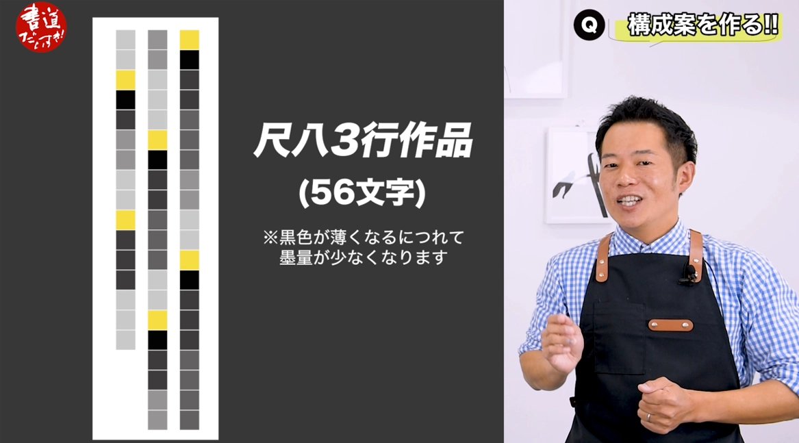
Now, moving on to three-column shakuhachi-screen works, which you mostly see in public competitions,
Shimauchi 12:02
in those kinds of works,
because they are being evaluated, they have to catch the viewer’s eye or they won’t stand out.
That means composition becomes even more important.
After all, the judges have to feel compelled to raise their hands for your work.
Shimauchi 12:20
So everyone puts a lot of effort into the composition.
The biggest focal point is typically in the upper part of the second column — around characters 23, 24, and 25.
That’s the key area, because naturally we view the work from top to bottom.
If there’s a character in the center that makes you think, “Oh!”
Shimauchi 12:39
it really draws your eye.
If there’s a wet, powerful character placed there, it has a strong presence.
Then, because contrast in ink density is important,
you also absolutely need places with drier strokes.
In the diagram here,
Shimauchi 12:59
if you make the characters at positions 1, 12, 26, 35, 43, and 50 wet and ink-rich,
you get a good flow of ink density throughout the work,
which gives it a sense of depth and three-dimensionality.
If any of you have never really thought about these kinds of rules before,
Shimauchi 13:18
I think that if you keep them in mind and then go back to look at works at exhibitions,
the way you see them will change 180 degrees from how it was before.
Don’t you think?
Even for me, Shimauchi, when I laid it out like this in a diagram,
I found myself thinking, “Oh, I see, that really makes sense.”
Shimauchi 13:35
It made me realize once again that the teachers are thinking about all of these difficult things
when they create their works.
At the beginning I said that creating works is not easy,
and this is exactly what I meant.
They’re thinking about the composition very logically.
Shimauchi 13:51
In a way, it feels almost like Western art, doesn’t it?
It was a fresh realization for me.
Next, let’s talk about choosing tools.
Among the tools,
the thing I found the most difficult to decide on — and the thing I felt I needed to take most seriously —
Shimauchi 14:07
was the paper.
We’ve tested all kinds of papers so far, right?
And we’ve experimented with their compatibility with different inks.
But when it came time for me to actually create a piece,
I had to ask myself whether I could really use the paper I was most familiar with,
Shimauchi 14:24
the Guanxingpai “Four-Foot Cotton Lian Xuan” that we’ve used so often.
I tried it, of course.
But for this piece, I wanted paper with less bleeding, a whiter color,
and a surface that would make the black of the ink really stand out,
so I chose a Taiwan-made paper instead.
Once I’d made that choice,
Shimauchi 14:45
the next step was the brush.
This time I thought, “Since it’s semi-cursive script, maybe I should try a softer brush,”
and I did give a soft brush a try,
but when it came to making the most of things like the spring of the hair and the speed of the strokes,
I found it quite difficult.
Shimauchi 15:02
So I realized that it would be best
for me to use the Kengo brush that I’m already used to.
So I decided to go with Kengo.
As for ink,
since I’ve taken the time to practice grinding it properly up to now,
Shimauchi 15:18
I wanted to grind it thoroughly and bring out a strong black in the piece.
So I used the same ink I use when copying sutras,
one that has a nice gloss and flows smoothly.
Now that I’ve assembled all the materials, at least for the first round,
Shimauchi 15:35
I have to admit, I’m already feeling pretty nervous,
but from here I’m going to bravely take on this unfamiliar world of creative work.
It isn’t about being good or bad.
More than anything, I just want to convey my feelings to all of you.
That’s the feeling I’ll be writing with.
Shimauchi 15:52
I’m going to challenge myself.
So I’d be very happy if you’d watch closely from here on and see how it goes.
I’ll do my best!
How was it?
Up to now, when it came to creating works, I tended to think,
“I can’t write without a model,”
Shimauchi 16:14
and, “Creative work is too hard for me, there’s no way I can do it,”
and I would end up shrinking back.
Honestly, that was how I really felt.
But when I used this opportunity to actually work on creating a piece,
I realized how enjoyable it is to create a work of your own.
At the same time, I learned that creating a piece is very demanding and requires steady, persistent effort.
Shimauchi 16:32
However, by having this experience,
I’m sure the way I see other people’s works will change dramatically.
If you’re someone who practices calligraphy and has even a small desire to create a work of your own,
to write characters that only you can write,
Shimauchi 16:51
then I strongly recommend that you give it a try.
If this video can help fan that small spark inside you into a slightly bigger flame,
I’ll be more than satisfied.
This has been Shimauchi, the guy who loves calligraphy.
I think this piece might end up being my Christmas present to myself this year.
Shimauchi 17:09
Nice, isn’t it?
About Related Products
Here are the items that appear in this video.
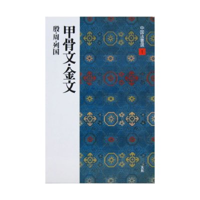
Books / Book & Publication
For everyone from complete beginners who want to start calligraphy to intermediate and advanced learners, the knowledge you gain from books is invaluable.
In addition to what you learn from your teacher’s exemplars, books are perfect for independent study and practice at home.
Deepening your knowledge of calligraphy will surely help broaden your horizons as well.


