
Shodo Daisuki Episode 69
Shodo Daisuki Episode 69
Question “Common Sense”! 5 Ways to Make Your Writing Look Beautiful!!【Calligraphy】
Shodo Daisuki – Episode 069
That “sense of progress” we all pursue as calligraphy practitioners!!
This time, we’ll introduce 5 writing techniques that let you feel that “sense of progress” right away!!
Things you’ve been doing unconsciously—thinking they’re simply “normal”—might actually be holding you back…
The path to beautiful handwriting can’t be mastered in a day!! Please enjoy until the end!!
Shodo Daisuki Episode 69: Video Overview
This is a record of Shimauchi’s lecture on calligraphy.
In this video, titled “Question ‘Common Sense’: 5 Writing Techniques to Make Your Characters Look Beautiful,” he offers practical advice for calligraphy enthusiasts.
At the beginning, Shimauchi asks viewers, “When is the most enjoyable moment in calligraphy?” and says that the excitement and sense of achievement when you write characters beautifully is one of the greatest joys of calligraphy.
He explains that the goal this time is to provide hints that help people—especially beginners and those studying on their own—feel “results” (a sense of progress) as early as possible.
Shimauchi introduces five techniques for making writing look more beautiful:
• You don’t have to write everything in a single stroke — He demonstrates that, especially when expressing strict, stele-like lines, using multiple strokes can create more effective results.
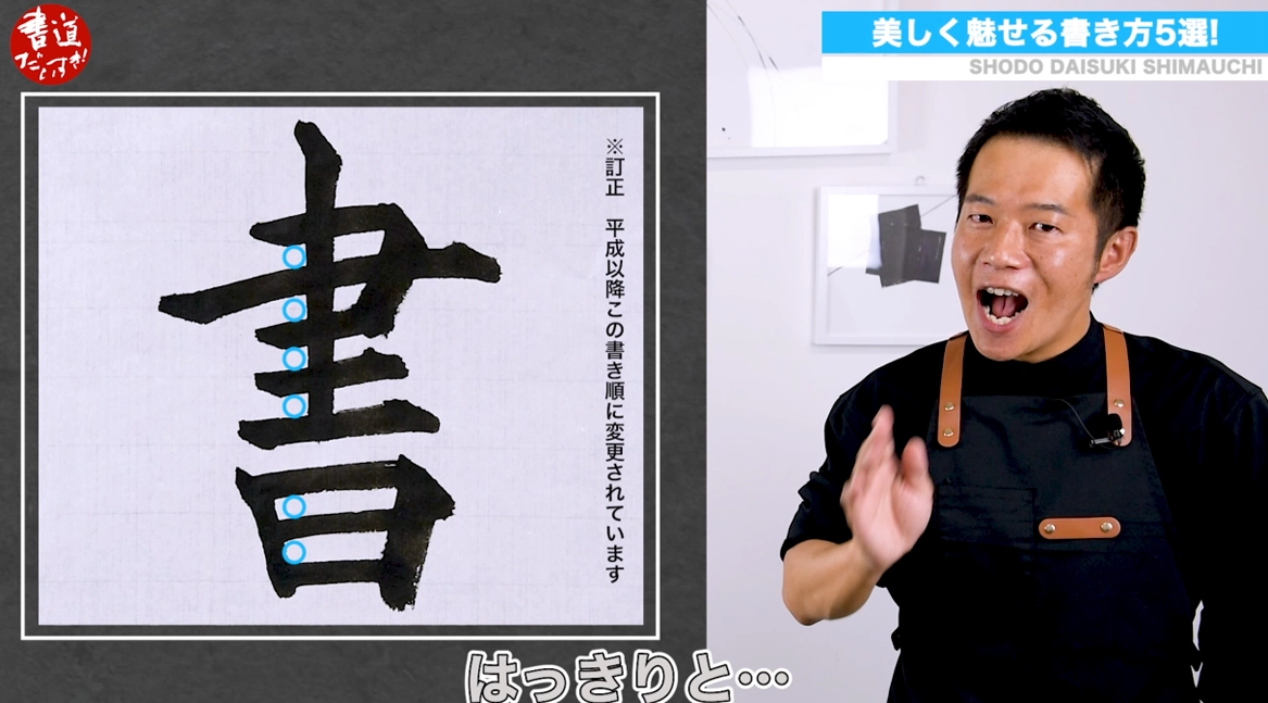
• Don’t be bound by standard stroke order — He explains how changing the conventional stroke order can be effective for creating even spacing, especially in characters like “大.”
• It’s okay to pause — For vertical strokes, he suggests stopping once mid-stroke to adjust pressure, which can produce a more beautiful line.
• The “center” isn’t always in the middle — For characters with a left radical and right component, he introduces a technique of adjusting each side’s center of gravity to create internal space, producing an effect that makes the character look “more spacious” even when small.
• Lines aren’t always “the same” — He explains that consciously changing the directionality of lines can alter the appearance of the character and the impression of the blank space.
To close, Shimauchi says he hopes viewers will practice these techniques to grasp a “sense of progress” in calligraphy sooner and enjoy the fun of calligraphy more deeply.
He also emphasizes that while evaluation from others is important, the true value lies first in “praising yourself and acknowledging your own progress.”
YouTube Shodo Daisuki Episode 69
しまうち 00:00
Please let me, Shimauchi, help you with this.
This is undeniably one legitimate brush-handling method.
Isn’t it okay to take a little break, too?
It makes the character look more spacious inside.
Hi, this is Shodo Daisuki Shimauchi.
Today’s episode is titled “Question ‘Common Sense’—5 Ways to Make Your Writing Look Beautiful.”
しまうち 00:22
Among those watching this channel, I’m sure there are all kinds of people—those who simply love calligraphy, those who have started recently, and those who already teach students, and so on.
This is sudden, but I have a question for all of you.
しまうち 00:38
When is the most fun moment while doing calligraphy? What do you think?
There are many scenes, like when you’re calmly grinding ink, or when you can handle the brush freely—I understand that.
But still, the single most fun moment is…?
しまうち 00:58
Wouldn’t it be when you wrote a character beautifully?
Once you taste that excitement and sense of achievement, it really becomes addictive.
Without exaggeration, when you experience a moment like that yourself, you might even mutter, “Wow… I did it,” to yourself.
しまうち 01:15
I end up mumbling to myself and praising myself.
Lately, I often think that for those of us who do calligraphy—including myself—what we are pursuing is a “sense of progress.”
For those who have just started calligraphy recently, quitting before you feel that progress is incredibly wasteful.
In these times, there are also people who cannot attend classes and are diligently practicing alone via online courses or correspondence.
To those people, it may be presumptuous, but I want to help you put these into practice early and feel progress right away—please let me, Shimauchi, do that for you.
I’ve prepared a few things that can serve as hints, so please stay with me until the end.
On this channel, we introduce more and more things related to writing—not just calligraphy—so please subscribe and tap the like button.
Now then, let’s get into the main part.
しまうち 02:11
Let’s begin right away.
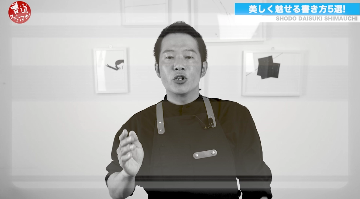
The first of the five techniques to make your writing look beautiful is: “You don’t have to write everything in one stroke.”
Let’s use the large corner as an example.
Everyone has their own habits, and you pull the line from the start to the finish, right?
At that time, you write it in one stroke in your own way.
That’s where each person’s writing habit shows up.
しまうち 02:31
And then sometimes you feel, “Man, the way I finish this is hard.”
And you may end up worrying because it’s difficult.
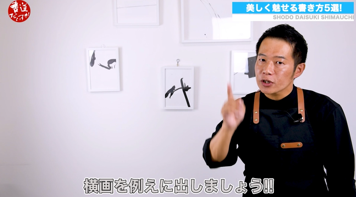
Especially for me, when I try to produce strict, stele-like lines, no matter what I do, in a single stroke the line quality doesn’t come out well, and the ending doesn’t “settle” in a cool way.
I struggled with that a lot.
So what did I do?
しまうち 03:22
Look—look at this.
Even without writing it in a single stroke, I was able to create an “Oh!” kind of expression.
Some of you might say, “Isn’t that cheating?” but I believe this is undeniably one legitimate brush-handling method, so please use it as a reference.
しまうち 03:35
Second: “Don’t be bound by stroke order.”
In characters where horizontal strokes continue, you may want to make the negative space between this corner and that corner as even as possible, but if you write strictly by the standard stroke order, it can be difficult to keep it even.
So why not change the stroke order entirely?
After all, in semi-cursive and cursive, the stroke order changes too, right?
That’s what I applied here.
What do you think?
しまうち 04:16
You can clearly grasp the spacing of the horizontal strokes, right?
You can really see and write them.
So if you find it hard to keep the negative space in that large-corner area even, please try this “don’t be bound by stroke order” strategy.
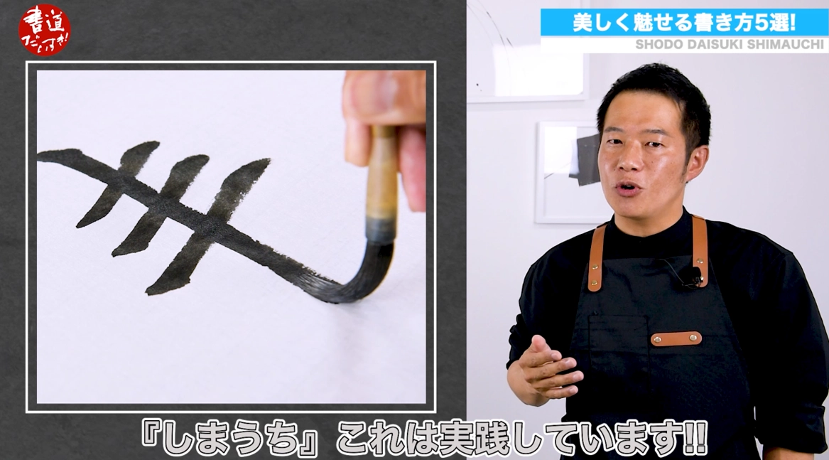
Third: “It’s okay to pause.”
When writing vertical strokes, you want to pull it crisply in one go, right?
If you can keep the left wall in mind and pull straight from start to finish, there’s no problem—but that’s not easy.
When you actually write it, you end up thinking, “It’s wobbling—what do I do?”
And when vertical strokes wobble, it stands out a lot.
If there are horizontal strokes followed by a vertical stroke, then instead of pulling the vertical stroke all at once, why not pause briefly where it crosses the large corner?
Adjust the pressure there, and then write the crisp vertical line again.
If you do that, you’ll feel a little more relaxed—and I actually use this method myself.
しまうち 05:34
Fourth: “The center isn’t always in the middle.”
Some of you may have wondered what that means.
In characters with a left radical and a right component, if you write the left side centered as if it were standalone, and then write the right side centered as if it were standalone, what happens?
The two parts collide right in the middle, don’t they?
And then, even if you feel you wrote it well, the character may end up larger than you intended.
So what should you do?
First, shift the center of gravity of the left side slightly to the right—so naturally the lines on the left become longer.
Then do the opposite on the right side: shift its center of gravity slightly to the left—so the lines extend more to the right.
The two parts no longer interfere with each other, and space appears between them.
How is it?
The character looks much brighter, doesn’t it?
This way, the character is small, but it looks “spacious” inside. Isn’t that great?
If you know this method for characters with a left and right component, it can make a huge difference.
しまうち 07:13
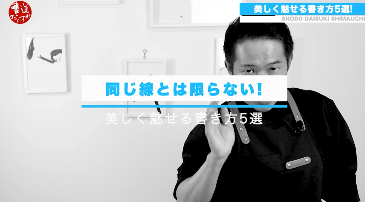
Fifth: “Lines aren’t always the same.”
What I mean is: when you write many lines, people sometimes end up writing them all with the same direction without realizing it.
For example, if three horizontal strokes appear in a row, you can imagine what happens if you write them all the same way.
If you look at the diagram, it’s easy to understand—but just by changing the direction a little, what happens?
The appearance changes, right?
And there’s one more thing people often overlook: when a space is enclosed by lines, if you write the large corner with the same upward slant to the right, the negative space inside can change depending on the direction of the lines.
This may be a slightly advanced technique.
But just by being aware of line direction, you can change the negative space that much—and the character becomes even brighter.
Changes in line direction are something people often do unconsciously without thinking that far, so this may be the part that most people overlook.
If you add this technique of changing line direction, your characters may become even more beautiful.
しまうち 09:05
That was five techniques—what did you think?
Some of you might have thought, “Oh, I didn’t know that,” while others might be nodding along, saying, “Yes, exactly, Shimauchi!”
And above all, just practicing these five things might lead you to that sense of progress.
Brush-handling has infinite possibilities, so let’s try many things together.
To be honest, I made this video fully prepared to be scolded for “Who are you to say that?”
It’s not easy at all to convey the fun of calligraphy to people who aren’t interested in it.
But for those with rich calligraphy experience, those who have started recently, and those who are interested in calligraphy, I want you to grasp that sense of progress as soon as possible—and enjoy the fun of calligraphy without missing out.
Being recognized and praised by those around you is truly wonderful, but first, praising yourself and acknowledging yourself—being able to do that is part of what makes calligraphy, which faces yourself sincerely, so amazing.
This was Shodo Daisuki Shimauchi.
See you again next week! Goodbye!
About Related Products
We introduce the products featured in this video.
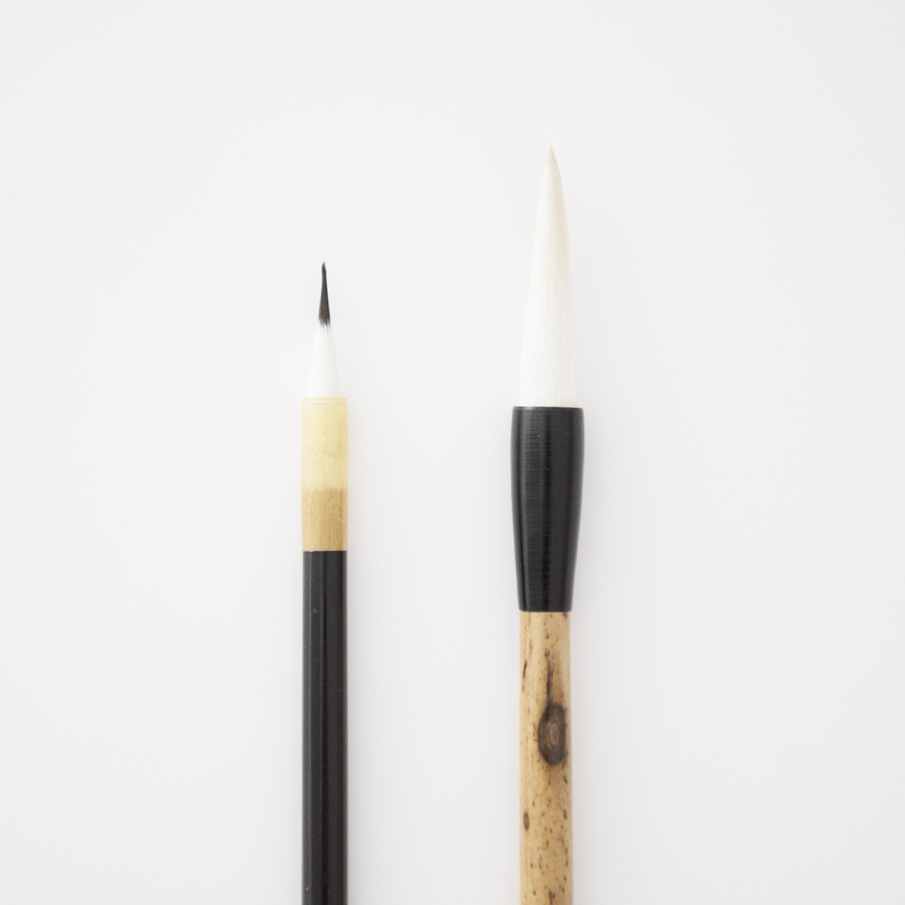
Brushes / fude
There are many types of calligraphy brushes, such as “Kanji brushes,” “Kana brushes,” “Student brushes,” “Tang-style brushes,” and “Performance brushes.”
Because there are so many options, many people feel their brush is hard to use and struggle with how to choose the right one.
At Shoyu Online, we work to help you choose with confidence by introducing how to select brushes and explaining their types.