

Shodo Daisuki Episode 52
Shodo Daisuki Episode 52
New Series! Classical Copying Vol.1 “Chu Suiliang – Preface to the Sacred Teaching at the Wild Goose Pagoda”【Calligraphy】
Shodo Daisuki – Episode 052
A brand-new企画 in which Shimauchi introduces recommended classical works and actually demonstrates copying them while explaining key points and things to watch out for!
The content is designed to be extremely easy to understand and feel familiar with!
Be sure to watch and challenge yourself along with the video!!
Shodo Daisuki Episode 52 – Video Overview
This video features Shimauchi’s “Classical Copying Series,” where he focuses on a famous classical work and demonstrates how to copy it.
In this episode, he takes up the “Preface to the Sacred Teaching at the Wild Goose Pagoda” written by 褚遂良 (Chu Suiliang), one of the three great calligraphers of the early Tang period, and explains its characteristics while demonstrating practical copying techniques.
褚遂良 was a calligrapher highly favored by Emperor Taizong of the Tang dynasty, especially renowned for his ability to distinguish genuine works of Wang Xizhi from forgeries.
Although Emperor Taizong trusted him deeply, after Taizong’s death Chu angered the crown prince (later Emperor Gaozong) by offering frank remonstrations, and was eventually exiled to what is now Vietnam, meeting a tragic end.
The “Preface to the Sacred Teaching at the Wild Goose Pagoda” is a text in which the Buddhist teachings brought back from India by the famous monk Xuanzang (Tripitaka Master) were translated into Chinese characters, Emperor Taizong composed a preface, and 褚遂良 wrote it out in 653 CE.
Shimauchi regards this work as one of the absolute top-level classics of East Asian calligraphy, on par with the “Inscription on the Sweet Spring of the Palace at Jiucheng.”
In the practical section, he selects four characters—「三」(three), 「教」(teach), 「潤」(moist/abundant), and 「無」(nothing)—and copies each of them while explaining their distinctive features.
He pays particular attention to modulation of the lines (thick–thin), tempo (slow–fast), and strength, as well as the use of white space and brush handling techniques.
While humbly describing his own copies as “clumsy,” Shimauchi strongly emphasizes the importance of practicing with a clear purpose in mind when doing classical copying.
He concludes by stressing the value of learning brush techniques and a sense of structure through classical copying, and expresses his desire to continue the “Classical Copying Series” in future videos.
YouTube Shodo Daisuki Episode 52
Shimauchi 00:00
There is a person who truly grasped the essence of Wang Xizhi’s calligraphy.
This work is one half of a pair of the most famous classics—the absolute “top of the top.”
And here again, another space is opened up.
Hi, this is Shimauchi, your calligraphy lover!
This time, under the title “Classical Copying Series,”
Shimauchi 00:23
I’ll be bringing you a new kind of episode.
I’ll actually work on copying a classical masterpiece myself, and I’d be delighted if we can learn together what exactly we can draw from that classic.
If you’re currently practicing classical copying but feel unsure whether your method is right or if you’re doing it properly,
Shimauchi 00:41
then in this episode I hope my own personal approach will offer some hints you can use as a reference.
The work we’ll be focusing on is the “Preface to the Sacred Teaching at the Wild Goose Pagoda,” written by 褚遂良, one of the three great calligraphers of the early Tang.
Shimauchi 01:04
On this channel, we introduce all kinds of topics related to writing—not just calligraphy—so please remember to subscribe and give the video a thumbs-up!
All right then, let’s dive into the classical series!
First, I’ll briefly and informally explain who 褚遂良 actually was.
Shimauchi 01:22
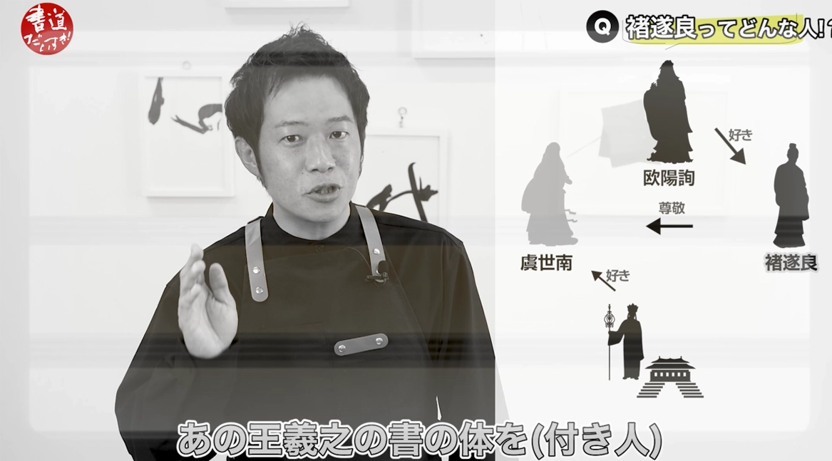
In the early Tang there were three great masters of calligraphy: Ouyang Xun, Yu Shinan, and 褚遂良.
褚遂良 was beloved by Ouyang Xun, one of these three masters, as his protégé.
At that time, Emperor Taizong especially treasured the calligrapher Yu Shinan.
Shimauchi 01:45
When Yu Shinan passed away, Taizong lamented, “Ah, Yu Shinan is gone… who will I discuss calligraphy with now? What am I to do?”
At that point, one of his attendants said, “There is someone who has studied Yu Shinan’s calligraphy and, more importantly, truly understands the work of Wang Xizhi.”
Shimauchi 02:03
“That person is called 褚遂良,” he reported to the emperor.
Taizong replied, “Excellent—summon him at once.” And so 褚遂良 entered service under Emperor Taizong.
Shimauchi 02:20
Taizong was utterly devoted to the calligraphy of Wang Xizhi.
He collected Wang’s works obsessively.
The person who judged the authenticity of these works—distinguishing genuine pieces from forgeries—was 褚遂良.
Shimauchi 02:36
褚遂良 was also the kind of person who could frankly admonish Emperor Taizong and speak his mind directly.
Because of this, Taizong cherished him deeply and is said to have felt that, even after his own death, all would be well as long as 褚遂良 remained to advise his successor.
Shimauchi 02:52
However, after Emperor Taizong passed away, 褚遂良 continued serving the crown prince, who became Emperor Gaozong.
Being very earnest by nature, 褚遂良 must have offered many candid remonstrations to Gaozong as well.
Unfortunately, he incurred the emperor’s anger.
Shimauchi 03:08
Gaozong declared, “Exile 褚遂良!” and he was banished all the way to Vietnam, where he met a sad and tragic end.
Such was the life of Chu Suiliang.
Now then, what is the “Preface to the Sacred Teaching at the Wild Goose Pagoda” about?
Shimauchi 03:29
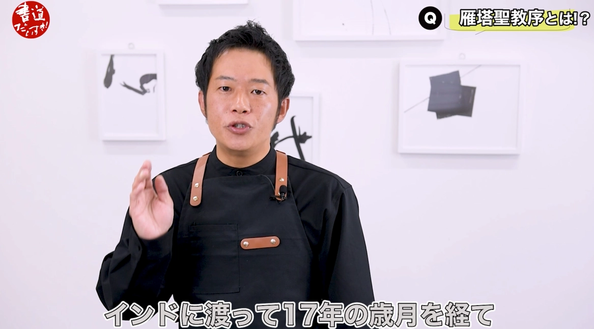
The famous Tripitaka Master, Xuanzang, traveled to India and, after 17 long years, brought the Buddhist teachings back to Chang’an.
These teachings were translated into Chinese characters.
Emperor Taizong composed the preface, the crown prince wrote the postscript, and in 653 CE 褚遂良 wrote out the text in calligraphy.
Shimauchi 03:52
Then a craftsman named Wan Wenshao carved the inscription into stone. Together, these two steles are collectively referred to as the work we know today.
Why did I choose the “Preface to the Sacred Teaching at the Wild Goose Pagoda” this time?
Well, although I personally love the “Inscription on the Sweet Spring of the Palace at Jiucheng,”
Shimauchi 04:15
if we ask, “What is the very best standard script in all East Asian calligraphy?” we invariably arrive at two works:
the “Inscription on the Sweet Spring of the Palace at Jiucheng” and the “Preface to the Sacred Teaching at the Wild Goose Pagoda.”
These two masterpieces stand as twin peaks among classics.
To me, in the “Jiucheng Palace Inscription,” beyond the brilliance of the characters themselves, the stone carving technique almost seems to surpass the calligraphy.
Shimauchi 04:39
That may be why the work feels so intense and tightly wound—as if the entire inscription radiates a sense of tension.
By contrast, the “Preface to the Sacred Teaching at the Wild Goose Pagoda” was carved a bit later, after Emperor Taizong’s death.
Although it is also carved into stone, it has a more semi-cursive flavor—something you might call “graceful” or “elegant.”
Shimauchi 04:58
To my eyes—this is purely my personal impression—the brilliance of the brushwork stands out even more prominently than the carving.
In this episode, I’d like to focus on three aspects of the lines: their modulation, their tempo, and their strength.
Shimauchi 05:17
With those points in mind, I’ll now dive into the classical copying practice.
All right—time to get to the hands-on part!
For the practical portion, I’ve selected some characters that, to me, strongly showcase the distinctive qualities of the “Preface to the Sacred Teaching at the Wild Goose Pagoda.”
Shimauchi 05:35
I’ll pick these characters out and write them here in front of you.
So first, the kanji numeral “三” (three).
Its most striking feature is the final stroke, the third horizontal line.
Shimauchi 05:56
It doesn’t quite feel like a typical “reverse-press” stroke; the way the brush is set and then driven forward is unusual.
The key is to place the brush tip, then use its spring to write a long horizontal line with strong modulation—but this is actually quite difficult.
Let me try it once now.
Shimauchi 06:23
Second stroke… then the third…
It still feels a bit off.
If I use a standard reverse-press like this, it turns out one way; if I reverse it in the opposite direction, it looks different again.
Neither feels quite right here.
Shimauchi 06:47
So instead, I’m trying to “set” the brush–just place it and drive from there. That’s the tricky part.
It’s tough, but I’ll write the whole character this way for now.
All right, something like this.
The lines are still a bit weak, I think, but I did my best to be mindful of the white space.
This is my attempt at the character “三,”
Shimauchi 07:09
with strong attention to that distinctive, modulated final horizontal stroke.
Next, we can see sections within the inscription that are clearly semi-cursive in flavor.
So it’s not a “rigid” standard script through and through.
Those semi-cursive parts appear here and there.
Shimauchi 07:27
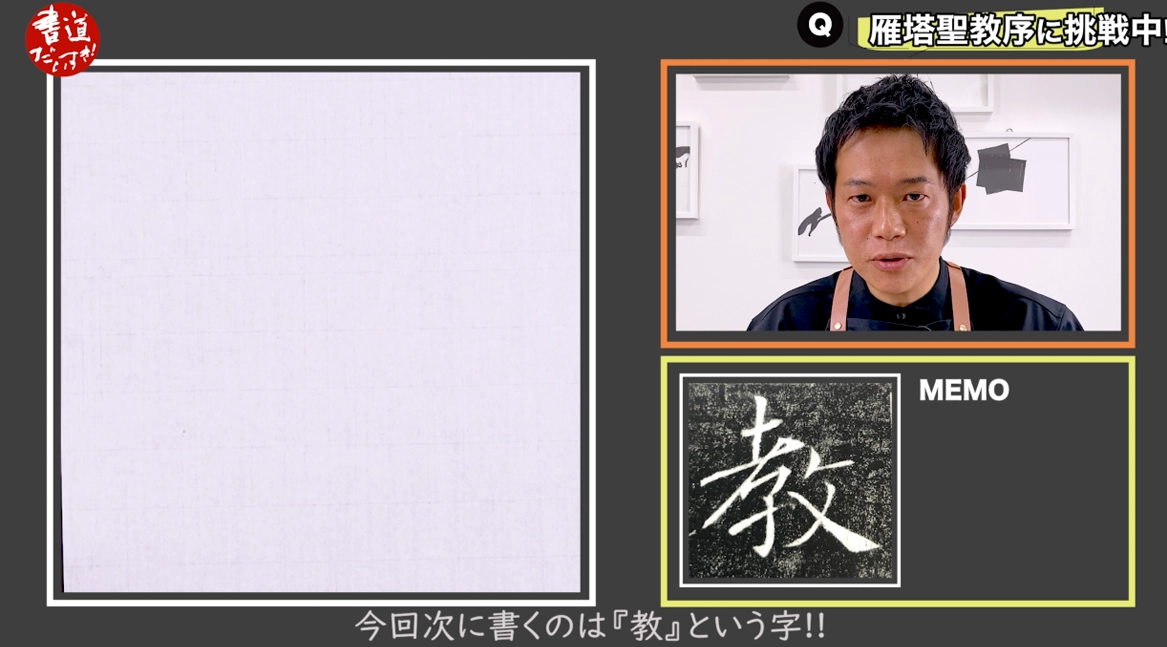
The next character I’ll write is 「教」 (teach).
If we look at the third and fourth strokes—something like this—they are clearly written in a semi-cursive manner.
Then we have the final sweep of the character, where certain parts suddenly become extremely thick.
Shimauchi 08:01
You can see that kind of stroke in many places throughout the work, and I think that’s one of its distinctive features.
Let me try writing it.
Hmm… the stroke might still be a bit weak.
The line should probably get quite thick here—this sudden boldness is also part of the character’s personality.
It’s pretty difficult to capture.
Shimauchi 08:26
Still, I’ll write out the whole character like this.
It’s hard! The third stroke is probably meant to be written firmly with “placed” strokes, and then connected into the next stroke, with the same approach throughout the left-hand component.
Shimauchi 08:55
This area here
probably needs to be a bit more open and spacious.
When you glance at my version as a whole, the line thickness seems fairly uniform, but on closer inspection you can see thicker and thinner lines—there is some variation there.
Shimauchi 09:16
I still feel there’s plenty of room for improvement.
Characters with both left and right components like this tend to crowd each other if you’re not careful.
It’s important to avoid letting the two sides come too close together or collide.
Shimauchi 09:42
So I tried to pay particular attention to the white space between them.
For example, the angle of these strokes here,
or the way I formed a “wall” on the right side of the left-hand radical—those choices were made with that space in mind.
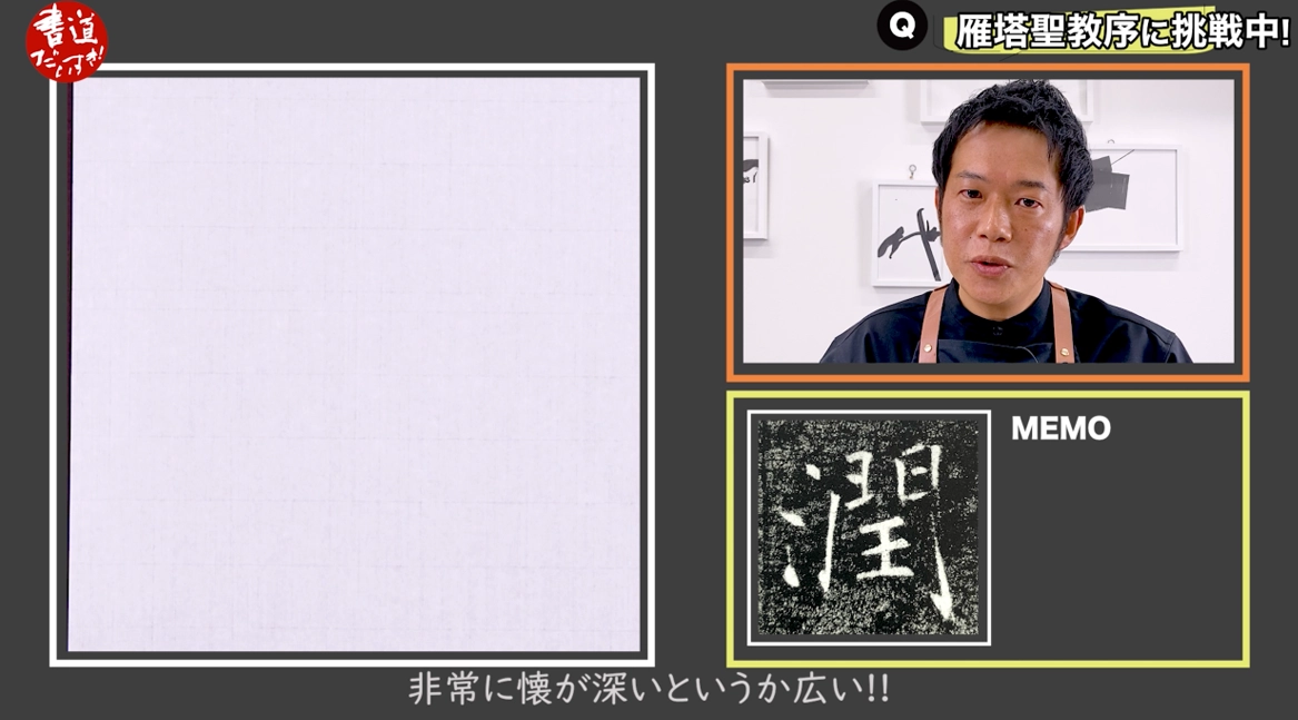
Next, let’s look at the character 「潤」 (moist, enrich).
Shimauchi 10:04
This character has a very deep, spacious “chest,” so to speak.
There is a lot of room where strokes connect and meet each other.
It feels both generously open and strictly structured at the same time, which is very interesting.
Shimauchi 10:21
Another point I’d like to highlight is right here, at the beginning of the gate radical.
The first vertical stroke has a slight outward slant, like this.
Then here, you take care to preserve ample white space.
And here—
Shimauchi 10:47
this stroke is slightly inward-slanting instead.
When you look at the original, this vertical stroke seems a bit wavy or soft, so many people may fixate on that and end up writing it in a shaky, hesitant way.
Shimauchi 11:08
Something like a weak, wavering line…
But that’s not quite right.
In my view, it’s better to write this stroke boldly and decisively, with a strong line.
So this part,
Shimauchi 11:28
creates a large, relaxed open space here.
You then place the inner strokes securely within that area.
The result is a beautifully balanced character, both in terms of white space and structure.
Shimauchi 12:04
As for the water radical on the left,
it feels as though the strokes are flowing lightly downward.
That creates even more space here.
I tried to be very conscious of that extra white space as well as the space around these strokes when I wrote it.
Shimauchi 12:21
And then I close it off like this.
That was my intention for this character as I wrote it.
It still feels a bit too flat to me, so I’d like to try writing it once more with a slightly taller, more vertical proportion.
Compared with my first attempt, I paid more attention to making it taller this time.
Shimauchi 12:48
One thing I realized is that, when forming the gate radical, we tend to want to make both sides straight, or both slightly slanted in the same direction.
However, in this work, one side is a vertical stroke and the other a slightly slanted one, giving variation.
Shimauchi 13:09
Then the “chest” inside the gate is kept nice and wide.
So once again, the white space is crucial.
And naturally, there are pockets of white space within the inner components as well.
It’s really impressive—Chu Suiliang’s work is
Shimauchi 13:27
truly masterful.
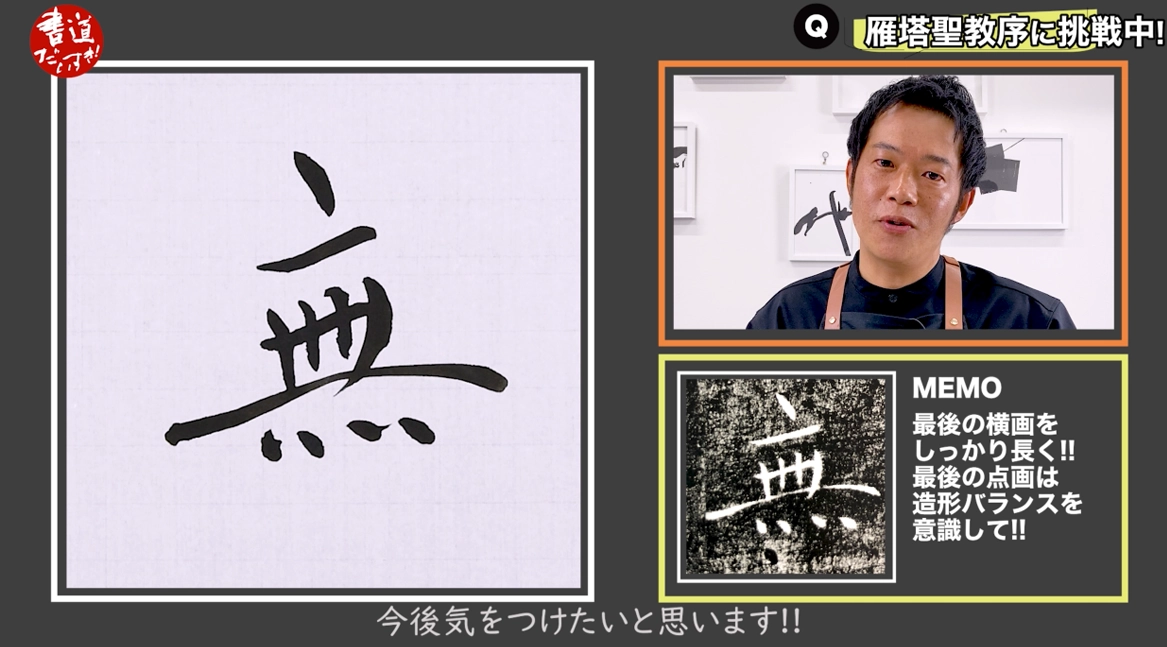
Lastly, let’s look at the character 「無」 (nothing).
I found myself strangely drawn to this one.
There’s something about its exquisite structural balance,
Shimauchi 13:45
the beauty of the white space, and the presence of long, modulated horizontal strokes that really speaks to me.
Depending on how you write it, you might sometimes see versions where the middle horizontal stroke is the longest, but in Chu’s version here
Shimauchi 14:02
he balances the character by making the last horizontal stroke the longest.
That’s what caught my eye and made me want to choose this character.
It’s a difficult one, though.
I’ll try to write the horizontals in the same spirit as that “三” we did earlier.
The “placed” strokes are still tricky for me.
Shimauchi 14:36
These dots are also very distinctive.
I may have made them a bit too large here, but the size and spacing of these dots is really remarkable.
Shimauchi 14:53
Then we have the four vertical-like strokes at the bottom.
Each one has its own subtle variation, which makes them very interesting to write.
Comparing my attempt with the original,
Shimauchi 15:16
I can see that this space here should be a bit wider—my white space is a little cramped.
This “placed” horizontal is also hard to get right.
I thought this area turned out reasonably well, but overall it’s still quite challenging.
Shimauchi 15:35
I clearly still have a long way to go with these placed horizontals.
Let me try once more.
This time I may have made the character a bit too tall.
In this work, many characters are actually quite flat horizontally, so
Shimauchi 16:03
perhaps I let myself be influenced by the previous character and ended up writing this one too tall in my attempt to emphasize white space.
Being aware that there are many flatter characters in this inscription is probably another important point to keep in mind.
Shimauchi 16:16
I’ll try to be more careful about that in future practice.
So today, I chose four characters that I felt were particularly distinctive and wrote them out.
To be honest, I haven’t been continuously practicing the “Preface to the Sacred Teaching at the Wild Goose Pagoda” all this time—
Shimauchi 16:34
it’s actually been a while since I last wrote it.
Even so, I really feel that working with this inscription is an excellent way to study brush handling in standard script.
For me personally, the biggest lesson is how to use the tip of the brush in these “placed” strokes—
Shimauchi 16:53
how to fully exploit that tip in the critical moments.
In that sense, I feel this work is very educational.
Of course, the characters I copied today are still clumsy and rough, to be sure.
But by practicing with a clear sense of purpose,
Shimauchi 17:10
you gradually start to see more and more in the original.
As I mentioned at the beginning, training your eye is very important.
You need to really study what makes the “Preface to the Sacred Teaching at the Wild Goose Pagoda” special—its unique characteristics—
Shimauchi 17:25
and then work on expressing those characteristics in your own writing.
I think that approach is essential, no matter which classical work you choose.
First, firmly grasp its distinctive features in your mind.
Then practice with those qualities clearly in mind, trying to embody them in your strokes.
Shimauchi 17:42
If you can also absorb the brush techniques in the process, that would be ideal.
So, how was it?
Today, I really felt—quite keenly—that mastering the very top-tier standard script of East Asia is anything but easy.
Shimauchi 18:00
However, by studying this classic, we can train our brush methods, strengthen our lines, and develop a broad, generous sense of structure and white space.
Going forward, I’d like to continue comparing this work with the “Inscription on the Sweet Spring of the Palace at Jiucheng,”
Shimauchi 18:19
keeping the features of each in mind, and enjoy classical copying through that comparison.
I plan to keep working on this Classical Copying Series, so if there’s a particular classic you’d like to tackle together with me,
Shimauchi 18:36
please let me know in the comments.
I’d love to study those works with all of you.
This has been Shimauchi, your calligraphy lover.
I look forward to seeing you again—goodbye for now!
About the Related Products
Here are the products that appear in this video.
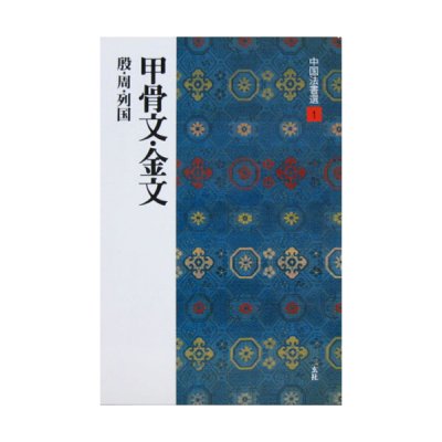
Books & Publications / book & publication
Whether you are a complete beginner just starting calligraphy or an intermediate to advanced practitioner, the knowledge you gain from books is extremely important.
In addition to learning from your teacher’s model, books allow you to study on your own at home and are ideal for self-study and practice.
Deepening your knowledge of calligraphy through books will surely help broaden your horizons as well.


