

Shodo Daisuki Episode 57
Shodo Daisuki Episode 57
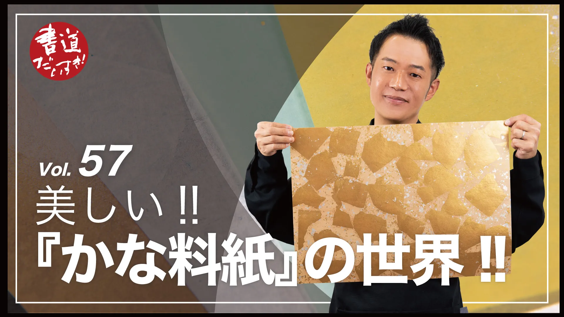
Beautiful!! The World of “Kana Ryoshi”!!【Calligraphy】
Shodo Daisuki – Episode 057
Brilliantly colored “Kana Ryoshi” papers!
But many people find the product names confusing and aren’t sure what they mean.
In this episode we introduce the paper types and techniques used for ryoshi, plus commonly used sizes and how to tell top/bottom—packed with useful tips!
Watch this and choosing ryoshi will become easier—and definitely more fun!
Shodo Daisuki Episode 57 – Video Overview
This is a lecture by Mr. Shimauchi titled “The World of Kana Ryoshi,” covering in detail the decorated washi papers used in calligraphy known as “kana ryoshi.”
He begins by defining ryoshi—what it is, its features, its types, and how to choose it.
Ryoshi refers to decorated washi primarily intended for kana works and shikishi boards; understanding product names helps you understand each paper’s characteristics.
First comes size: “zenkaishi” (full-size懐紙) is the base size.
Cut in half, it becomes “hankaishi”; cut into eight, it becomes “tanzaku” (poem strips); further divide to get “ko-shikishi” (small shikishi).
Next are the raw materials: he introduces the three main fibers “kōzo” (paper mulberry), “ganpi,” and “mitsumata.”
Mitsumata is noted for its strength suitable for printing and is used in banknotes.
Then he explains representative techniques used to make ryoshi:
Dōsa sizing – the foundation of ryoshi making
Dip dyeing – immersing paper in dye
Brush dyeing (hiki-zome) – coloring with a brush
Gradation dyeing (bokashi) – creating tonal gradients
Gubiki – coating with gofun (calcium carbonate)
Kira (mica) application – sprinkling fine mineral powder
Karakami / karazuri – woodblock patterning / blind-printing
Sunago / kirihaku / noge – gold and silver decorative techniques
Finally, he shows how to tell the top/bottom of ryoshi based on motif direction, tonal balance, and how gold flakes are scattered.
He closes by praising the Heian-era tradition of ryoshi making, encouraging viewers to try these beautiful papers that add elegance to many kinds of works.
YouTube Shodo Daisuki – Episode 57
Shimauchi 00:00
In the world of kana ryoshi, “zenkaishi” is the base size.
It’s said to be strong enough for printing.
Gubiki (pigment coating) notably sits on top of the paper.
These rules still apply—hello, this is Shodo-Daisuki Shimauchi.
Shimauchi 00:19
Today’s topic is “The World of Kana Ryoshi.”
If you practice calligraphy, you’ll recognize those colorful, glittering papers—yes, ryoshi.
But many product names are full of unfamiliar words—
Shimauchi 00:34
like dōsa-biki, bokashi-zome, gubiki, kira-biki…and you may feel lost.
Shimauchi 00:46
The ryoshi long loved in Japan has precise terms and names.
After this video, you’ll be able to infer “what kind of paper this is” and “how it writes” just from the product name.
Shimauchi 01:03
Choosing ryoshi will become easier—and more enjoyable.
I’ll also cover sizes and selection tips, so please watch to the end!
On this channel we share all things related to writing—not only calligraphy—
Shimauchi 01:18
so please subscribe, like, and comment.
Welcome to the world of kana ryoshi.
First: what exactly is kana ryoshi?
Shimauchi 01:36
Of papers made for calligraphy/painting, those used as-made are called “soshi.”
When processed, they are “kakōshi,” called “shuxian” in China—this was new to me.
Among these processed papers,
Shimauchi 01:53
ryoshi are decorated papers prepared especially for kana works (fine-line and mid-line kana).
Since modern times, some ryoshi match large shikishi sizes; some people even use ryoshi for kanji works.
Shimauchi 02:14
Next, sizes. The standard is “zenkaishi.”
I’ve long wanted to share how versatile zenkaishi is.
Look at this diagram—
Shimauchi 02:31
cut zenkaishi in half vertically to get hankaishi—
that much is common knowledge.
Shimauchi 02:47
Here’s the neat part: divide zenkaishi into eighths to get standard-width tanzaku.
Many may not know that!
And there’s more—
Shimauchi 03:06
take one tanzaku strip on the left, then divide the right side into four equal rectangles—
and you get four small shikishi.
(Not large shikishi—small ones.)
Shimauchi 03:24
Zenkaishi is truly useful: one sheet yields tanzaku, chōshi-gami, and hankaishi.
Note: people often confuse hankaishi with standard hanshi size.
Shimauchi 03:43
Teachers may ask for “hankaishi,” but students mistakenly buy “hanshi.” I’ve been there!
Hankaishi is longer vertically than hanshi—please be careful.
As for exhibition sizes—
Shimauchi 03:58
there are “denshiban,” “hanketsuban,” and the less familiar 1×3 shaku, 2×6 shaku,
and 2.6×6 shaku boards—knowing these will cover most cases.
Shimauchi 04:17
Now, paper fibers—the foundation of ryoshi.
Three main materials:
Shimauchi 04:36
(1) Kōzo: long, thick fibers, very strong—used in backing papers and shōji.
(2) Ganpi: cultivation is difficult, so it’s often harvested wild; rare and valuable.
Shimauchi 04:52
Fibers are very fine and short yet strong, with a sheen and fine texture.
(3) Mitsumata: like ganpi, short and fine fibers—
Shimauchi 05:14
historically newer among the three (since the Edo period),
but very strong and suitable for printing.
Shimauchi 05:28
I learned from Benjamin that it’s used in banknotes—
next time you handle money, think “Mitsumata!”
Shimauchi 05:42
Now, representative ryoshi-making techniques.
There are many unfamiliar terms—let’s learn together.
Shimauchi 05:57
Technique #1: Dōsa sizing—
the foundational first step that stops bleeding, strengthens the base, and aids later processing.
Shimauchi 06:14
The dōsa solution is alum water mixed with animal glue, brushed evenly over the raw sheet—
like applying primer before makeup.
Shimauchi 06:36
Technique #2: Dip dyeing—
immerse dōsa-sized paper into a dye bath to color it.
Shimauchi 06:56
Papers labeled “…-zome” use this method—like tea-dyeing (black tea, coffee, green tea) we enjoyed in Episode 41.
Technique #3: Brush dyeing (hiki-zome)—
Shimauchi 07:16
load a brush with dye and sweep across the sheet.
It looks simple, but achieving an even coat is truly difficult—masters make it look effortless.
Shimauchi 07:33
When ryoshi arrives, they just “swish”—that’s mastery.
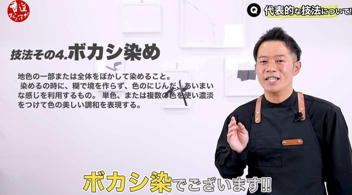
Technique #4: Gradation dyeing (bokashi)—
Shimauchi 07:47
use a brush or tampo to create gradients.
Brushes give straighter transitions; tampo yields soft, diffused tones.
Shimauchi 08:04
I’d love to try it—looks fun, though surely very hard.
Shimauchi 08:16
Technique #5: Gubiki—this had puzzled me.
Mix gofun (calcium carbonate) with glue and brush it on.
Shimauchi 08:36
Gofun is made by firing clam or oyster shells, then grinding to powder.
Shimauchi 08:54
There are also colored gubiki coatings (“iro-gu”).
Unlike dyed papers (color penetrates the sheet), gubiki sits on the surface—this is key.
Shimauchi 09:12
Technique #6: Kira (mica) application—
I used to misread “雲母”; it’s “kira/mica.”
Shimauchi 09:28
Mica is a mineral; after dōsa, sprinkle ultra-fine shimmering powder.
Shimauchi 09:45
Tilt the sheet to the light and it twinkles—common on classic copy papers like Koyagire.
Shimauchi 10:19
Technique #7: Karakami & Karazuri.
For karakami, mix mica with funori, dab onto a woodblock (with carved pattern),
Shimauchi 10:47
lay gubiki paper over the block, and burnish from the back with a baren to transfer the pattern.
Shimauchi 11:07
In karazuri (blind printing), use an un-inked block under the sheet and burnish from above,
Shimauchi 11:30
raising the pattern subtly—often invisible until light hits it at an angle.
Shimauchi 12:11
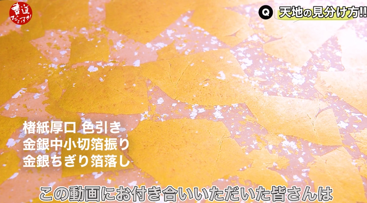
Technique #8: Sunago, Kirihaku, Noge (gold/silver).
Many in Japan associate ryoshi with these decorations.
Shimauchi 12:27
Names depend on size/shape:
Sunago—tiny particles like scattered sand (seen in Heian/Genji-era works).
Shimauchi 13:02
Kirihaku—square/rectangular flakes of various sizes.
Noge—very thin, hair-like strips of gold/silver; found in late-Heian works like the Gonenbon Kokinshū.
Shimauchi 13:45
Product names combine these techniques—once you know them, names make sense.
Shimauchi 14:02
Without that knowledge, long names feel cryptic—
but now you’re equipped, and choosing will be easier.
Shimauchi 14:16
Next, how to decide top/bottom.
For plain sheets, there’s no top/bottom—use either side.
Shimauchi 15:07
With motifs (e.g., arabesques), orient faces/flowers upward.
Shimauchi 15:41
If motifs appear top and bottom, choose the side with the larger margin as the top.
Shimauchi 16:03
If there’s a gradient, put the darker color at the top.
If colors evoke sky/earth, put sky-blue at the top and earthy tones at the bottom.
Shimauchi 16:41
For sunago, heavier clusters indicate the top.
If distribution is similar, again choose the side with the larger margin as the top.
Shimauchi 16:59
With two colors (gold and silver), place gold at the top—like gold vs. silver medals.
Shimauchi 17:35
Wave patterns can also suggest orientation—follow the wave crest direction.
Shimauchi 18:07
These rules apply to shikishi-size ryoshi too—remember them.
Shimauchi 18:24
The tradition of ryoshi dates back to the Heian period.
I hope this helped with choosing ryoshi.
Shimauchi 18:38
In today’s “aesthetic” social era, ryoshi surely played that role in Heian times—
one can imagine nobles admiring how “it pops.”
Shimauchi 19:12
Ryoshi isn’t only for kana—
try poems, lyrics, or letters; these vivid papers will adorn your words.
Shimauchi 19:31
Please try ryoshi not just once, but many times to come.
Someday, I’d love to make ryoshi myself—such are my thoughts tonight.
Related Products
Here are the products featured in this video.
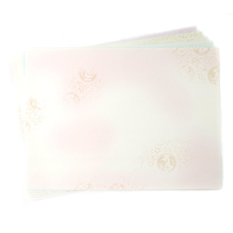
Ryoshi / ryoshi
You can’t talk about Japanese calligraphy history without “kana.”
In the Heian period, gorgeously decorated papers were developed and refined, giving birth to an elegant kana culture.
Papers processed and decorated especially for kana works are called “ryoshi.”


